[Update: yes, there has been a title change. The old one was stupid.]
The other day, some weather geek friends of mine and I were exchanging emails about the early snow that was happening in Ithaca, NY.
It reminded Steve Colucci of the start of the Winter of ’93. That one began with a snowstorm on Halloween and ended with the monstrous nor’easter in March. A particularly brutal year; a long, hard, cold winter.
It was the year Tom Hamill and I started as grad students at Cornell and took Colucci’s dynamics class. I recall trick-or-treating in graduate student housing with some families who had just arrived from Brazil. They and their kids had never seen snow before and were thrilled. They wanted it to go on forever. And it did. They weren’t so thrilled by January when, after yet another night of snow, they had to dig their cars out once more, only to come home and discover that the parking spot they had labored over so long was taken by somebody else. It was that year that I vowed to move to Texas.
This year has started like ’93, but will it end like it?
Meteorologists often forecast by analogy. What’s that? Well, nothing more than looking at some pattern in the weather that happened sometime in the past, noticing that today’s pattern is similar, and then forecasting what will happen as what did happen. Weather weenies—the affectionate nickname given to those who memorize every storm since their birth—often use this technique to good success.
Chaos
Forecasting by analogue took a big hit once Ed Lorenz came out with his gorgeous paper “Deterministic non-periodic flow”, i.e. chaos. Lorenz was running a very simple weather model on a computer, storing its output, when that computer, as computers do, crapped out. Lorenz had to start over, and did, but he was surprised to discover that the results from the second run deviated strongly from the first run.
Lorenz started the second run with initial conditions that were, he thought, the same as in the first run. And they were, to several decimal places. Close enough! But those minute differences were enough to blow up to huge macroscopic differences in the output. This condition was eventually given the name sensitivity to initial conditions, and is why forecasting by analogy doesn’t always work. The small differences between the previous weather pattern and today’s could blow up so that tomorrow’s weather is nothing like what it was in the past.
So how much weight should we give the fact that this winter is starting out like the bad one in ’93?
CPC
There is one group that asks these kinds of questions routinely. The Climate Prediction Center, a branch of NOAA. We are asking a question about climate here, and not weather, because we want to know what will happen over an entire season.
Here is the CPC temperature forecast for the three month period, December, January, February (DJF):

This format is a little screwy and takes some getting used to. Here is the idea behind it. Climate is actually a statistical phenomenon. It is something like an average of daily weather. To define climate requires picking bounds so we know when to stop and start averaging. The bounds are 30-year periods, starting and stopping on decades: thus 1971-2000 (or maybe it’s 1970-1999) is the period called the “climate normal”. Average weather/climate is defined with respect to this period.
This means that when you hear “Today’s temperature is above normal” it specifically is in reference to the climate normal period. Today’s temperature may not be considered “above normal” if you picked a different 30-year period. “Normal” doesn’t mean normal. There is nothing abnormal about any weather that eventually occurs. This is important to keep in mind when thinking about topics like global warming.
Now, since we have picked a reference set of data, we can use it to quantify our uncertainty in any outcome, such as the DJF average temperature. We can take the last 30 DJF temperatures and split them into three bins: a low, middle, and high. The splits are such that the 10 lowest temperatures are in the low bucket, the next 10 in the middle bucket, and the highest 10 in the high bucket. The CPC calls these three buckets, B for below “normal”, N for “normal”, and A for above “normal”; I used the scare quotes around “normal” to remind you that the word isn’t used in the same sense as its common English meaning.
With me so far? Historically, and by design, there is a 33 1/3% chance that any seasonal temperature will fall into one of the three buckets. Right? If you didn’t know anything about the future climate except what happened during the climate normal period, you would guess that there is a 33 1/3% chance that the seasonal temperature will be “below normal”, a 33 1/3% chance that it will be “near normal”, and a 33 1/3% chance that it will be “above normal.” Make sure you get that before reading more.
The CPC does know something about the future. It uses mathematical forecast models, analogy, expert opinion, chaos—yes, chaos—to predict what will happen. It can use chaos by running a forecast model based on certain initial conditions. They then “perturb” those initial conditions slightly such that the perturbations are in line with the uncertainty in the measurement of those conditions, and then run the models again. They do this many times, each model run beginning with different initial conditions. At the end, you can take something like an average of all the model runs. This process—which I have barely sketched—is called ensemble forecasting, and is an area Tom Hamill has devoted his career to, producing a lot of significant results.1
Anyway, the CPC then takes everything it knows about the future climate and then uses it to adjust the probabilities the temperature will fall into one of the buckets. They do this for many different points over the United States. If there is an area in which they believe they can say nothing useful, they do not change the bucket probabilities. For example, look at West. That area is all white, indicating that there is no useful information in the forecast models that change the probabilities. Thus, for this coming DJF, there is a 33 1/3% chance the temperature will fall in the B bucket, a 33 1/3% chance it will fall in the N bucket, and a 33 1/3% chance it will fall in the A bucket. Just the same as you would have guessed knowing nothing but the climate normal period.
Now focus on Wisconsin. There is an “A” inside a “50” contour line. This means, for that area, the CPC says there is a 50% chance the DJF temperature will fall in the A bucket. It still means a 33 1/3% chance that it will fall in the N bucket, but it must mean that there is only a 100 – 50 – 33 1/3 = 16 2/3% chance it will fall in the B bucket. The N bucket is almost always left along, and only the A and B buckets are adjusted.
What about Texas? It has an “A” and inside a 33 1/3% – 40% contour, meaning what? Right. They haven’t adjusted the probabilities much at all, say + 3%. We can notice that there are no “B” areas on the map, which means they do not think any area has an increased chance that the temperature will be below “normal.”
All this means is that the CPC thinks the DJF period, if anything, has a higher chance to be warmer than normal in some Great Lakes areas.
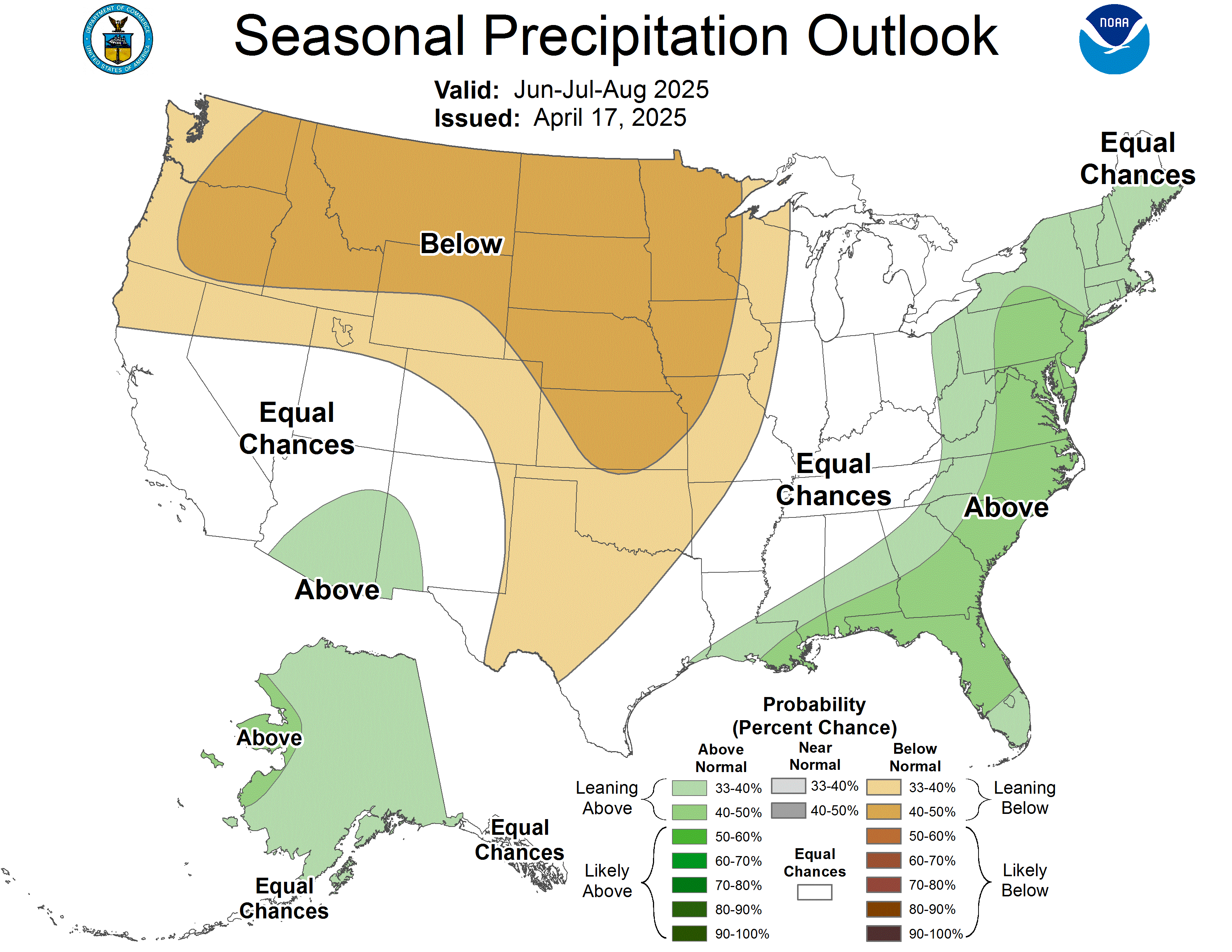
There are also precipitation amount forecasts. Click here to see the pcp (shorthand for precipitation—if you want to sound like you know what you’re talking about, never say “precipitation”, say “precip” with a long “e”; you’ll be taken for a real meteorologist).
Does it work?
This is the question. If you are using any prediction/forecast/statistical model you must ask whether using it adds any value. This is true for weather and climate forecasts and for any other quantity you care about: stocks, your health, test scores, and on and on.
The true mark of usefulness is skill. Skill represents improvement over “just guessing.” You should calculate skill of any statistical model that you use, whether or not it built for forecasting (all statistical models are forecasting models, but that’s a subject for another day).
For the CPC forecasts, skill means beating the “climate normal” guess; that is, the guess of 33 1/3% for each bucket. If the CPC cannot beat saying, essentially, “I don’t know”, then the forecast should not be used. If the CPC forecast does not have skill, it means you will do better by ignoring it.
Now, skill is a score of some kind, and there are many skill scores. Many are ad hoc, created because their users thought they sounded good. Some skill scores can give a false impression of the true value of a forecast/model. The probabilistic behavior of skill scores is a tricky business and quickly leads to surprisingly deep math. (I know, because this is my area, and I often find myself swimming in uncharted waters.)
Dan Wilks, of Cornell, has spent some time investigating the skill of CPC forecasts. He has found that the one-month ahead forecast has modest skill. Forecasts for longer lead times have some skill, but not much, and it quickly dies out. He found that there is no skill after about 12 months.
Here is the CPC’s assessment of their own skill:

They use something called the “Heidke skill score” (search for the term on that page). It is not what I would have chosen since it is, I think, suboptimal in this case: it will exaggerate performance. Nevertheless, let’s go with it.
The score must be above 0; scores below 0 mean the “I don’t know” forecast did better. Look only at the blue line: this is the skill you’d get it you relied on the CPC forecast routinely. The red line only calculates skill for those areas in which they adjusted the bucket probabilities: this has some use, but it is not the true skill that a forecast user would see.
The blue line is mostly above 0 (the dashed blue line is the average score over this time period). There is some semi-periodicity in the skill lines. Some of this is due to know causes like the El Nino and La Nina phenomena. Other causes aren’t known (if they were, then they could be forecasted!).
Overall, not a terrible performance, but not stellar either (recalling the Heidke score exaggerates a bit). It’s very very hard to predict climate. But at least the CPC is open and up front about their performance. They show their skill right next to the forecast and so earn a lot of respect because of this. Also, contrary to what you might have heard, meteorologists are pretty good about guessing the future. As long as that future is not too far off.
Store the nuts or not?
The CPC says, for most areas, “I don’t know.” The analogy says, “Look out!” The—very badly behaved and misleading—gambler’s instinct says, “Well, we haven’t had a bad winter for a long time, so we’re due for one.” The Farmer’s Almanac, a periodical written by trolls in some sub-basement completely disconnected from reality, says “Could be a bad one.”
I won’t tell you my forecast. I will tell you I bought a brand new, thick overcoat.
See you in the Spring!
————————————————-
1The advances have been mainly in weather and not climate models. The models that you hear about predicting global warming have not reached state of the art with respect to ensemble forecasting.
Discover more from William M. Briggs
Subscribe to get the latest posts sent to your email.
You ought to take bets on the temp just like Lucia does on the sea ice. I keep telling people that it’s going to be a cold one this winter – I don’t know why, it just feels like it will be.
I think this winter in the US will at least “feel” colder for most people because even though gas prices are down, they’ll still drop their thermostat a few degrees to try and save some $$$. Since most people are indoors all winter, a “colder” house will make them think it’s a colder winter by comparison to previous years.
Or it really will be colder.
After you mentioned the predict a warmer than average winter for the midwest, I was hoping for some terrific skill scores! I want warmer. (I also have a warm winter coat.)
Bishop Hill– I suspect Briggs doesn’t want to run bets where no matter what, he has to bake brownies for the winner! :)
Lucia,
Nobody would ever join a contest in which I threatened to bake them brown
Is this concept of model ensemble in the description above the source of the IPCC model ensemble nonsense talked about at CA and Lucia’s blog (talked about rationally by the posters on those blogs, but nonsensically by the IPPC and AGW supporters). Because they seem to be completely different.
What you describe above is a single model, in which many runs are made by slightly varying the initial conditions to give an “ensemble” forecast with some quantifiable variance. This could then be compared to the actual weather that occurs to test the predictive power of the model.
The nonsense being tested in the Santer paper is the non-random collection of many different models, with different underlying physics, each weighted differently.
I see now where the CO2 climatologists could have gotten the idea for model ensembles, but it makes no sense that it could be used in the same way.
Clark,
Although people have called multi-model averaging “ensemble forecasting”, that term is usually reserved talking about perturbing a single model.
In ensemble forecasting, the initial conditions may be perturbed, or even the physics might be perturbed.
There is nothing inherently wrong with multi-model averaging. You just have to be careful how you do it. Suppose you compute some function of many models (not necessarily an average) and call that function the forecast. The real statistic of performance is how that statistic does against the actual observations. It is not how that function does over past observations or how it performs according to some statistical “test.”
Proof is in the eating of the pudding.
Briggs– Well, you didn’t enter the NH ice contest. No brownies for you!
Clark– There isn’t necessarily anything wrong with the idea of averaging over all the models to project and/or forecast. The arguments are over how one should test whether the models have any skill or whether they are sufficiently far off the mark to decree the are off track in their climate projections (for whatever reason.)
It is pretty clear what the modelers call “internal variability” of those some of those models has only a tenuous connetion to whatever it is they like to call “weather noise”.
Also, it’s worth noticing that Briggs says
“They do this many times, each model run beginning with different initial conditions. ”
Ask Briggs to quantify “many”. I bet the weather forecasters run each model more than 5 times. When I downloaded the IPCC projections from The Climate Explorer, 5 is the largest number of repetitions for any individual model running the A1B scenario. In my experience, statisticians rarely consider 5 to be “many”. The fact that there are so few IPCC model runs is one of the reasons it is difficult to test whether they are biased compared to observations.
The averages always confound me. The DJF temperature is a single datum (number) yet the phenomenon of temperature is a continuous and highly variable time series. Does a single number adequately reflect an entire 3-month second-by-second stream of data? Also I note that the graph has more than 4 points per year, so it is not displaying 3-month averages. I don’t know what it shows. Some other highly crunched statistic, I suppose.
You state “This means that when you hear ‘Today’s temperature is above normal’ it specifically is in reference to the climate normal period.” That may be a true statement but it is a misjudgement on the part of the speaker, since ‘Today’s temperature’ is in no way a reflection on a 3-month average. One would expect that EVERY daily temperature would be above or below normal. And what is a daily temperature but another average of the stream?
The real (useful) information is the area below the temperature curve, the amount of energy (heat work) at the particular locale. That is why agriculturalists often report degree-days, to try to get a handle on the energy in the (biological) system over some time period (like a growing season). Single point-in-time temperature extremes can be important, but not as important as the total heat work done to the system.
The mad concern with “average” temperature leaves me cold (pun intended). I wish people (climatologists) would focus on heat work (total energy over a time period). But that might not be as satisfactorily alarming as the chronic howling about some point-in-time measure being different from some (arbitrary) average. People like to be alarmed, I guess. Or maybe the weatherbabes are working in cahoots with the blood pressure medicine industry (unknowingly, it goes without saying).
Don’t mention the squirrels!
You can’t hibernate yet anyway, you’ve got to give a post mortem on the election predictions.
This was very useful, especially about the thirty year normal that has puzzled me for ages.
Will the next normal be 1980 to 2010? Or will it stay the same?
Why thirty years?
Lucia:
I’m a bit slow but have just noticed the link to the fairy story on the other post. It’s a lovely one. Maybe where CS Lewis got his inspiration for his Narnia queen.
I once referred to a meteorologist as “the master of an inexact science” and he took offense. He declared that the science was precise, but it was just that all the functions in the algorithm were not known. I’m still pondering that one.
Not sure if I read that right (most probably), but if I did, there’s a mistake there mr Briggs. The 33% line is the frontier between a “not adjusted probability area” and “above 33% adjusted probability area”, meaning that the area inside that line is above 33%, and before we reach the 40% line it is lower than 40%.
So texas has something like 37%, or similar.
Luis,
You’re right! I said it wrong. I’ll go up and fix it.
Mike,
Read this.
Matt said:
I say it is wrong if you don’t know with absolute certainty exactly what the numbers you’re averaging represent.
Dan:
Good point. In fact if you are averaging the outputs of different models, shouldn’t the outputs all be comparable – and defining what different, relatively complex models mean is no easy matter. It is a little bit like predicting inflation, your bundle of goods have to be in some sense comparable.
It is my impression that the ensemble is not assembled, you might say, from results obtained by only perturbations in initial conditions. Different models are used, along with different numerical solution methods, different application procedures, different run-time options, different boundary conditions, and different users. And yes, different users can make significant differences.
Plus, apparently, no attempt is made to filter out which of these many ‘models of Earth’ actually represent the Earth from those that don’t. How can you be sure that you’ve actually calculated an apple?
Finally, the numbers come from, are generated by, computer codes. One should never ever forget or overlook this extremely important fact. The most important aspect of all. It is critical that the computer code be Verified to be calculating apples. As examples of what this entails, see this.
Given all this, how can you merely assume that you’re averaging apples with apples and avoid determination that the assumption is correct?
hmmm … the URL link at ‘see this’ doesn’t work:
http://danhughes.auditblogs.com/2008/10/31/pattern-matching-in-gissnasa-modele-coding/
Hmmm, interesting. Ensemble forecasting described here seems to be similar to bootstrapping.
Here in SE Australia, the weather forecasts are 75% accurate out to 5 days. Pretty good IMHO.
After 5 days the computations generate infinities (nonsense), so each day the current data replaces what was forecast and the program run again, a process called renormalisation. This is very different to climate modeling where real world data is not used (according to Kevin Trenberth).
Mike D is entirely correct that accumulated heat is very important, but it’s not the whole story. Weather (and hence climate) includes precipitation/evaporation, frost and wind.
There was a severe and widespread frost last week in Tasmania that stripped fruitlets from grapes, cherries and apples. No amount of accumulated heat can overcome that. So we can have a seasonal average that looks good on paper, but was a disaster in reality where farmers are forced to live. Glad I’m not a market gardener any more.
Also I notice that CSIRO’s forecast is for increasing drought in contrast to their real world studies that show drought decreasing in frequency since the 1960s for most of Australia and fairly constant in Tasmania/Victoria. So it goes…